360 DWELLINGS
We rebranded 360 Dwellings to elevate it into a standout national real estate brand, clarifying its purpose, increasing marketing engagement and enabling faster content creation. The result was a 260% return on investment in the first year, with measurable gains in sales, efficiency and team performance.
-
Client: 360 Dwellings, Colorado, US
Challenge: Help 360 Dwellings become the leading national real estate brand it deserves, increase the number of annual transactions, gain brand recognition and set up new ways of growing its top-producing team, all by differentiating itself in the relentless US real estate market.
Outcome: The client reported an overall clear brand purpose that reflects the company’s values and vision, a streamlined marketing workflow, faster and easier in-house content creation, increased confidence in both the founders and the team, and recognition of their visual identity across Denver and the state of Colorado.
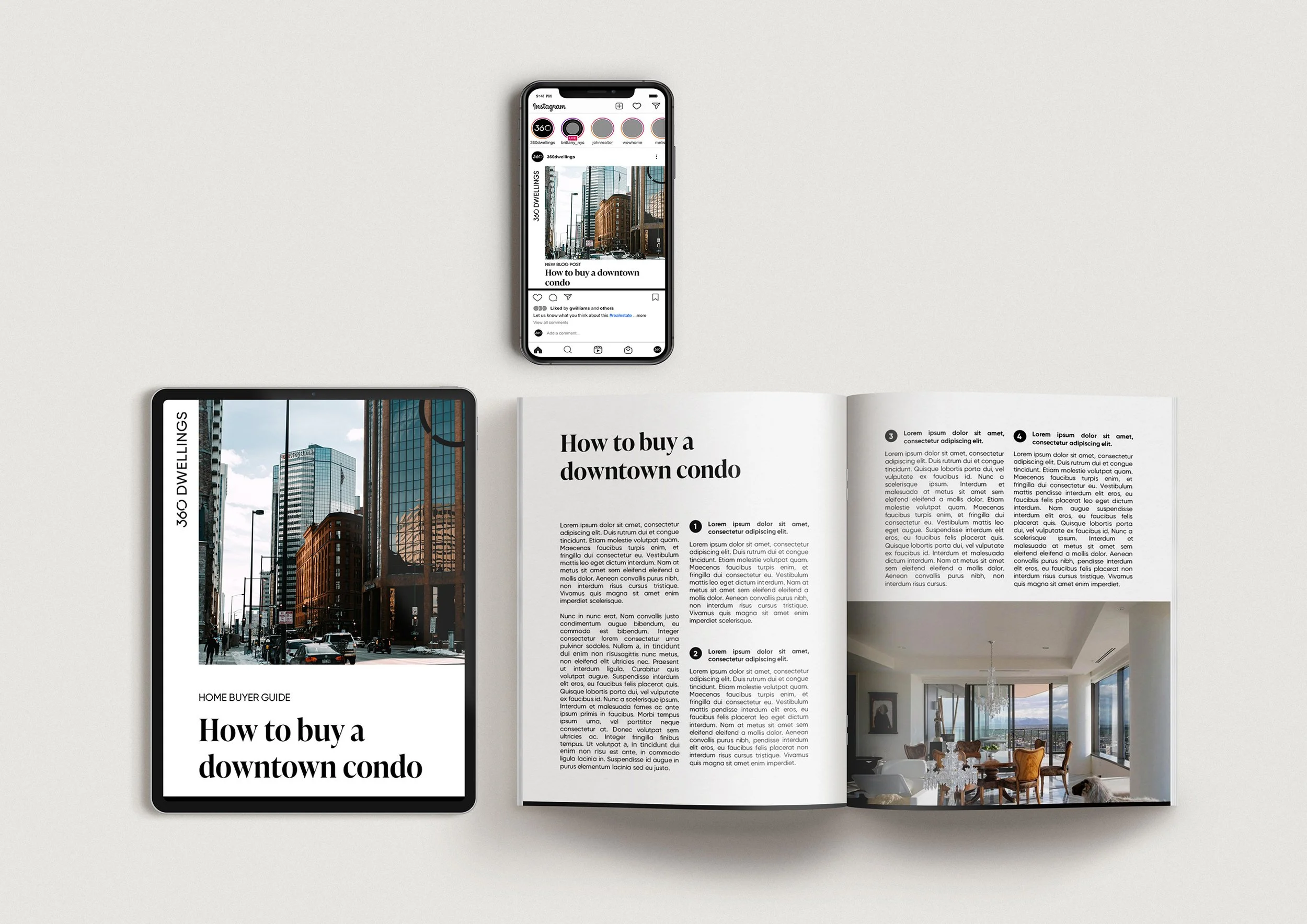
Visual Identity: The new 360 Dwellings identity draws from Denver’s urban grid and the iconic circular “CO” symbol from the Colorado flag, representing the sun, soil, and the state’s distinctive geography. Combined with the business name, the “360” logo element was instantly well-received.
-
Real estate rebranding, brand strategy, marketing strategy, content strategy, visual identity, branding guidelines, logo design, print and digital collateral, client brochure, office signage, social media graphics, newsletter design and team-growing strategy.